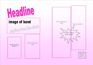
Double Page spread of magazine-mock up
This is a mock up of my double page spread for my music magazine. This article will relate to the artist who is the main feature on the front cover of my magazine. I have kept a consistent format of the colours I have used and also the fonts used. It contains a headline, this will capture the audience to read the article and not turn over to the next page. This is also the same effect I am trying to create by including a caption from the story. Also one main image will be used, this will be of the band together. I will also use smaller images which relate to the article. I have included text boxes of where my text should be layed out. I have also decided to mock up a album front cover of the band I am interviewing. As my article is based on the bands new album, I thought it would be good to advertise this product, this is also known as a puff.


No comments:
Post a Comment