
Friday 17 December 2010
Front cover of my music magazine
Fifth draft front cover of my music magazine

Fourth draft front cover of my music magazine

Third draft of the front cover of my music magazine

Wednesday 15 December 2010
Second draft of the front cover of my music magazine

First draft of the front cover of my music magazine

Monday 13 December 2010
Images taken for my music magazine


This image I believe is the most effective so will appear on the front cover of my magazine.

I am going to use this image on my front cover because it suits the style of my magazine the most.

I have decided not to use this image.

This image is going to be used for my album front cover for my puff on my double page spread.

This image I am going to use on my double page spread of my magazine as it looks like it has been created for this purpose.

I have decided not to use this image yet, but i may contain it on my double page spread later on if I decided it looks boring with only one image

I have decided to use this image for my contents page because it fits in well with this.
Friday 10 December 2010
Font style for masthead
This is my final chosen masthead style that will appear on the front cover of my magazine. I am now going to say why I have chosen this styling and why I didn't decide to choose the other ones I had selected.
From the five fonts I had selected I have decided to choose this text style for my masthead which will appear on the front cover of the magazine. I have decided to choose this writing type as even though it isn't striking, with effects added to the plain text, it can make the writing style stand out. By applying colour to the writing it will make it attractive also. Another advantage of this style is that it is clear and readable. Also from looking at my feedback from the people I questioned it was clear that this should be the font style I should use.

Ratings for masthead font
To find out which masthead style was the best to appear on my music magazine I decided to print out the five samples I had chosen and show these to 20 different females aged between 15-24. I decided to ask people in this category as this is who my magazine will be aimed at. I decided to ask this question because I could then get feedback from the group to see which they preferred and which they didn't. This would then help me make my decision. I printed out the 6 different styles and asked them-Which do you prefer?
From looking at my answers I got a great response on the first style. The audience said they liked it as once it was edited with colour e.t.c it would jump out at them. They also said that the style was different and looked like it belonged on the cover of a pop magazine. They believed the others was to simple and that they didn't belong on the cover of a pop magazine. Therefore I decided to choose the first option for my masthead.
From looking at my answers I got a great response on the first style. The audience said they liked it as once it was edited with colour e.t.c it would jump out at them. They also said that the style was different and looked like it belonged on the cover of a pop magazine. They believed the others was to simple and that they didn't belong on the cover of a pop magazine. Therefore I decided to choose the first option for my masthead.
Different fonts for my masthead
I have used the website http://www.dafont.com/ to try out different styles for my masthead which is called Radar! By trying out different fonts I can see which I prefer and would be best to use on the front cover of my magazine. Here they are shown in black and white but when I apply them on to my magazine I will change the colour of them, to fit in with my colour scheme.


Wednesday 8 December 2010
Final ideas for my magazine
Now from conducting all of my research I have decided what to and what not to contain in a music magazine. With my general ideas developed which included the genre of music I am going to based my magazine on, pop music, price, £2.25, how often the magazine is published, fortnightly and my target audience, females aged 15-24.
Front Cover
I have now decided on other features that my magazine needs to make it like other magazines that are published in the market today. I have decided that my masthead title is going to be called Radar! This is because I believe it is a catchy and its short and snappy. Many music magazine titles are just one worded or even just one letter, examples such as Kerrang!, Q. I have then decided to use a sell line to go with my masthead this will be called "on the look out for a new beat". This links in with both the masthead as a radar is "on the look out" and by connecting this with the word beat it shows its associated with music. I have decided to use three basic colours of a deep pink black and white as my main colours. By only using three colours it makes the magazine look professional and not tacky with lots of different colours jumping out at you. My text will be bold and eye catching and will have similar fonts. My masthead will have a different font so the title stands out more. By doing this it makes it look different from all the rest.
I have decided to base my main feature on a band named "Above the Noise". I have decided to choose this name because it sounds realistic and a name that people would talk about who are interested in pop music. My other features will be about a solo artist called Poppy Moore, and her meltdown in the limelight. It could also be based on her been stressed under the limelight. In my digital mock-ups In placed images of fashion, and had brief ideas for fashion articles. I believe this wouldn't work as it has no relation to music. Another feature could be reviews on the latest movies/Cd's e.t.c by a music star. These will need to be backed up by a headline that will draw in the audience to buy the magazine.
Contents Page
On my contents page I have decided to keep a constant colour scheme, showing a constant run throughout. My title of contents is bold and on a slant giving an edge to the magazine, this again is in a deep pink colour. I have also decided to include a letter from the editor, this will be summarising what will be contained in this issue of the magazine. This is good feature to contain on a contents page as the reader can just skim this to see if the content appeals to them, this could determine whether the customer purchases the magazine or not. I have also divided my stories into different sections and placed a border around them. By doing this it is easy to find where a story will be in the magazine. Next to each of these there will be a page number in bold and a sentence underneath summarising each story. I have also included images of features what are going to be within the magazine. This makes it more visual to the reader, and on the image is the number of what page the feature will be on. I have also contained a win symbol in the middle of the page, by doing this it shows that the audience have the chance to win something.
Double Page Spread
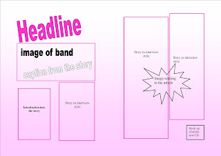
On my double page spread I have again kept a constant colour scheme. I have decided to have my headline in a deep pink colour again. This also shows consistency. At the top of the first page I have decided to include a image of the band and a caption from the story will be placed across the bottom of this. I will then include a deck. A deck is something that introduces the article in my case it will be introducing the band. My story of the band will be styled in a question and answer format and this will be placed into columns on both of the pages. The columns of text will have a border around them, the same used on the contents page. The questions will be in a different colour and style to the answers so they stand out more. At the bottom of my page I am going to include a puff. This is a promotion of a product not relating to the magazine. As one of my questions in my article is going to be about the release of the bands first album I am going to create a mock up of a album front cover. This will make the magazine look more professional, I found this out because in one of the magazines I did my LIIAR analysis on had this device in it. I am finally going to include a bubble in the middle of the page this will include a image relating to the answers given in the story.
Front Cover
I have now decided on other features that my magazine needs to make it like other magazines that are published in the market today. I have decided that my masthead title is going to be called Radar! This is because I believe it is a catchy and its short and snappy. Many music magazine titles are just one worded or even just one letter, examples such as Kerrang!, Q. I have then decided to use a sell line to go with my masthead this will be called "on the look out for a new beat". This links in with both the masthead as a radar is "on the look out" and by connecting this with the word beat it shows its associated with music. I have decided to use three basic colours of a deep pink black and white as my main colours. By only using three colours it makes the magazine look professional and not tacky with lots of different colours jumping out at you. My text will be bold and eye catching and will have similar fonts. My masthead will have a different font so the title stands out more. By doing this it makes it look different from all the rest.
I have decided to base my main feature on a band named "Above the Noise". I have decided to choose this name because it sounds realistic and a name that people would talk about who are interested in pop music. My other features will be about a solo artist called Poppy Moore, and her meltdown in the limelight. It could also be based on her been stressed under the limelight. In my digital mock-ups In placed images of fashion, and had brief ideas for fashion articles. I believe this wouldn't work as it has no relation to music. Another feature could be reviews on the latest movies/Cd's e.t.c by a music star. These will need to be backed up by a headline that will draw in the audience to buy the magazine.
Contents Page
On my contents page I have decided to keep a constant colour scheme, showing a constant run throughout. My title of contents is bold and on a slant giving an edge to the magazine, this again is in a deep pink colour. I have also decided to include a letter from the editor, this will be summarising what will be contained in this issue of the magazine. This is good feature to contain on a contents page as the reader can just skim this to see if the content appeals to them, this could determine whether the customer purchases the magazine or not. I have also divided my stories into different sections and placed a border around them. By doing this it is easy to find where a story will be in the magazine. Next to each of these there will be a page number in bold and a sentence underneath summarising each story. I have also included images of features what are going to be within the magazine. This makes it more visual to the reader, and on the image is the number of what page the feature will be on. I have also contained a win symbol in the middle of the page, by doing this it shows that the audience have the chance to win something.
Double Page Spread
On my double page spread I have again kept a constant colour scheme. I have decided to have my headline in a deep pink colour again. This also shows consistency. At the top of the first page I have decided to include a image of the band and a caption from the story will be placed across the bottom of this. I will then include a deck. A deck is something that introduces the article in my case it will be introducing the band. My story of the band will be styled in a question and answer format and this will be placed into columns on both of the pages. The columns of text will have a border around them, the same used on the contents page. The questions will be in a different colour and style to the answers so they stand out more. At the bottom of my page I am going to include a puff. This is a promotion of a product not relating to the magazine. As one of my questions in my article is going to be about the release of the bands first album I am going to create a mock up of a album front cover. This will make the magazine look more professional, I found this out because in one of the magazines I did my LIIAR analysis on had this device in it. I am finally going to include a bubble in the middle of the page this will include a image relating to the answers given in the story.
Monday 6 December 2010
Double Page spread of magazine-mock up
Thursday 2 December 2010
Contents page of magazine-mock up

Subscribe to:
Posts (Atom)