
Friday 17 December 2010
Front cover of my music magazine
Fifth draft front cover of my music magazine

Fourth draft front cover of my music magazine

Third draft of the front cover of my music magazine

Wednesday 15 December 2010
Second draft of the front cover of my music magazine

First draft of the front cover of my music magazine

Monday 13 December 2010
Images taken for my music magazine


This image I believe is the most effective so will appear on the front cover of my magazine.

I am going to use this image on my front cover because it suits the style of my magazine the most.

I have decided not to use this image.

This image is going to be used for my album front cover for my puff on my double page spread.

This image I am going to use on my double page spread of my magazine as it looks like it has been created for this purpose.

I have decided not to use this image yet, but i may contain it on my double page spread later on if I decided it looks boring with only one image

I have decided to use this image for my contents page because it fits in well with this.
Friday 10 December 2010
Font style for masthead
This is my final chosen masthead style that will appear on the front cover of my magazine. I am now going to say why I have chosen this styling and why I didn't decide to choose the other ones I had selected.
From the five fonts I had selected I have decided to choose this text style for my masthead which will appear on the front cover of the magazine. I have decided to choose this writing type as even though it isn't striking, with effects added to the plain text, it can make the writing style stand out. By applying colour to the writing it will make it attractive also. Another advantage of this style is that it is clear and readable. Also from looking at my feedback from the people I questioned it was clear that this should be the font style I should use.

Ratings for masthead font
To find out which masthead style was the best to appear on my music magazine I decided to print out the five samples I had chosen and show these to 20 different females aged between 15-24. I decided to ask people in this category as this is who my magazine will be aimed at. I decided to ask this question because I could then get feedback from the group to see which they preferred and which they didn't. This would then help me make my decision. I printed out the 6 different styles and asked them-Which do you prefer?
From looking at my answers I got a great response on the first style. The audience said they liked it as once it was edited with colour e.t.c it would jump out at them. They also said that the style was different and looked like it belonged on the cover of a pop magazine. They believed the others was to simple and that they didn't belong on the cover of a pop magazine. Therefore I decided to choose the first option for my masthead.
From looking at my answers I got a great response on the first style. The audience said they liked it as once it was edited with colour e.t.c it would jump out at them. They also said that the style was different and looked like it belonged on the cover of a pop magazine. They believed the others was to simple and that they didn't belong on the cover of a pop magazine. Therefore I decided to choose the first option for my masthead.
Different fonts for my masthead
I have used the website http://www.dafont.com/ to try out different styles for my masthead which is called Radar! By trying out different fonts I can see which I prefer and would be best to use on the front cover of my magazine. Here they are shown in black and white but when I apply them on to my magazine I will change the colour of them, to fit in with my colour scheme.


Wednesday 8 December 2010
Final ideas for my magazine
Now from conducting all of my research I have decided what to and what not to contain in a music magazine. With my general ideas developed which included the genre of music I am going to based my magazine on, pop music, price, £2.25, how often the magazine is published, fortnightly and my target audience, females aged 15-24.
Front Cover
I have now decided on other features that my magazine needs to make it like other magazines that are published in the market today. I have decided that my masthead title is going to be called Radar! This is because I believe it is a catchy and its short and snappy. Many music magazine titles are just one worded or even just one letter, examples such as Kerrang!, Q. I have then decided to use a sell line to go with my masthead this will be called "on the look out for a new beat". This links in with both the masthead as a radar is "on the look out" and by connecting this with the word beat it shows its associated with music. I have decided to use three basic colours of a deep pink black and white as my main colours. By only using three colours it makes the magazine look professional and not tacky with lots of different colours jumping out at you. My text will be bold and eye catching and will have similar fonts. My masthead will have a different font so the title stands out more. By doing this it makes it look different from all the rest.
I have decided to base my main feature on a band named "Above the Noise". I have decided to choose this name because it sounds realistic and a name that people would talk about who are interested in pop music. My other features will be about a solo artist called Poppy Moore, and her meltdown in the limelight. It could also be based on her been stressed under the limelight. In my digital mock-ups In placed images of fashion, and had brief ideas for fashion articles. I believe this wouldn't work as it has no relation to music. Another feature could be reviews on the latest movies/Cd's e.t.c by a music star. These will need to be backed up by a headline that will draw in the audience to buy the magazine.
Contents Page
On my contents page I have decided to keep a constant colour scheme, showing a constant run throughout. My title of contents is bold and on a slant giving an edge to the magazine, this again is in a deep pink colour. I have also decided to include a letter from the editor, this will be summarising what will be contained in this issue of the magazine. This is good feature to contain on a contents page as the reader can just skim this to see if the content appeals to them, this could determine whether the customer purchases the magazine or not. I have also divided my stories into different sections and placed a border around them. By doing this it is easy to find where a story will be in the magazine. Next to each of these there will be a page number in bold and a sentence underneath summarising each story. I have also included images of features what are going to be within the magazine. This makes it more visual to the reader, and on the image is the number of what page the feature will be on. I have also contained a win symbol in the middle of the page, by doing this it shows that the audience have the chance to win something.
Double Page Spread
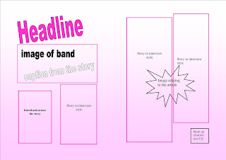
On my double page spread I have again kept a constant colour scheme. I have decided to have my headline in a deep pink colour again. This also shows consistency. At the top of the first page I have decided to include a image of the band and a caption from the story will be placed across the bottom of this. I will then include a deck. A deck is something that introduces the article in my case it will be introducing the band. My story of the band will be styled in a question and answer format and this will be placed into columns on both of the pages. The columns of text will have a border around them, the same used on the contents page. The questions will be in a different colour and style to the answers so they stand out more. At the bottom of my page I am going to include a puff. This is a promotion of a product not relating to the magazine. As one of my questions in my article is going to be about the release of the bands first album I am going to create a mock up of a album front cover. This will make the magazine look more professional, I found this out because in one of the magazines I did my LIIAR analysis on had this device in it. I am finally going to include a bubble in the middle of the page this will include a image relating to the answers given in the story.
Front Cover
I have now decided on other features that my magazine needs to make it like other magazines that are published in the market today. I have decided that my masthead title is going to be called Radar! This is because I believe it is a catchy and its short and snappy. Many music magazine titles are just one worded or even just one letter, examples such as Kerrang!, Q. I have then decided to use a sell line to go with my masthead this will be called "on the look out for a new beat". This links in with both the masthead as a radar is "on the look out" and by connecting this with the word beat it shows its associated with music. I have decided to use three basic colours of a deep pink black and white as my main colours. By only using three colours it makes the magazine look professional and not tacky with lots of different colours jumping out at you. My text will be bold and eye catching and will have similar fonts. My masthead will have a different font so the title stands out more. By doing this it makes it look different from all the rest.
I have decided to base my main feature on a band named "Above the Noise". I have decided to choose this name because it sounds realistic and a name that people would talk about who are interested in pop music. My other features will be about a solo artist called Poppy Moore, and her meltdown in the limelight. It could also be based on her been stressed under the limelight. In my digital mock-ups In placed images of fashion, and had brief ideas for fashion articles. I believe this wouldn't work as it has no relation to music. Another feature could be reviews on the latest movies/Cd's e.t.c by a music star. These will need to be backed up by a headline that will draw in the audience to buy the magazine.
Contents Page
On my contents page I have decided to keep a constant colour scheme, showing a constant run throughout. My title of contents is bold and on a slant giving an edge to the magazine, this again is in a deep pink colour. I have also decided to include a letter from the editor, this will be summarising what will be contained in this issue of the magazine. This is good feature to contain on a contents page as the reader can just skim this to see if the content appeals to them, this could determine whether the customer purchases the magazine or not. I have also divided my stories into different sections and placed a border around them. By doing this it is easy to find where a story will be in the magazine. Next to each of these there will be a page number in bold and a sentence underneath summarising each story. I have also included images of features what are going to be within the magazine. This makes it more visual to the reader, and on the image is the number of what page the feature will be on. I have also contained a win symbol in the middle of the page, by doing this it shows that the audience have the chance to win something.
Double Page Spread
On my double page spread I have again kept a constant colour scheme. I have decided to have my headline in a deep pink colour again. This also shows consistency. At the top of the first page I have decided to include a image of the band and a caption from the story will be placed across the bottom of this. I will then include a deck. A deck is something that introduces the article in my case it will be introducing the band. My story of the band will be styled in a question and answer format and this will be placed into columns on both of the pages. The columns of text will have a border around them, the same used on the contents page. The questions will be in a different colour and style to the answers so they stand out more. At the bottom of my page I am going to include a puff. This is a promotion of a product not relating to the magazine. As one of my questions in my article is going to be about the release of the bands first album I am going to create a mock up of a album front cover. This will make the magazine look more professional, I found this out because in one of the magazines I did my LIIAR analysis on had this device in it. I am finally going to include a bubble in the middle of the page this will include a image relating to the answers given in the story.
Monday 6 December 2010
Double Page spread of magazine-mock up
Thursday 2 December 2010
Contents page of magazine-mock up

Monday 29 November 2010
Front cover of magazine-mock up

Friday 26 November 2010
Thought shower double page spread

Thought shower contents page

Thought shower front cover

Wednesday 24 November 2010
Ideas for my main feature image on my front cover

This image of an album front cover has inspired me to create something similar on the front of my magazine. I researched the Internet for CD covers and believed this was the best as it shows a girl band. I am going to create a similar mock-up to this and place it on the front cover of my magazine. My first idea is that they are going to pose with objects in their hand. I have also decided that all of the members are going to have a particular colour that each of them would be represented by.
General ideas
After researching I have decided that my magazine:
Genre is-pop music.
Target Audience is-aimed at females aged 15-24, as there isn't no magazines of this kind around at the moment unless its related to a TV show.
Published-fortnightly.
Priced-£2.25.
Genre is-pop music.
Target Audience is-aimed at females aged 15-24, as there isn't no magazines of this kind around at the moment unless its related to a TV show.
Published-fortnightly.
Priced-£2.25.
How often to publish my magazine and the price
I have decided to publish my magazine on a fortnightly basis. I believe this is the best choice of publishing issues because people in my target audience frequently talk about the latest news in what is happening to music stars. Also, I have come up with this decision because of my analysis of three other music magazines. Q magazine that wouldn't attract my target audience was published monthly, X Factor magazine was published weekly and Top of The Pops magazine was also published monthly. I decided not to publish weekly because be time a story is finished edited and printed in a magazine it may be old news. By publishing a magazine monthly I believe it is to long to wait for new stories to be published.
I have decided to price my magazine at £2.25, I believe this is a reasonable price to pay on a fortnightly basis because relating it to my target audience of 16-24. Based on demographics, this age range will be able to afford the price on a fortnightly basis. People in this age group may not be earning a wage, or may be earning a minimum wage so this is a suitable price to set. From also re-looking at my analysis of magazines the prices of these magazines where X factor £1.95, Q £4.50 and Top of the pops magazine was priced at £2.35. I have priced mine around the same price as X factor and Top of the Pops as they are the kind of magazines I am looking at.
I have decided to price my magazine at £2.25, I believe this is a reasonable price to pay on a fortnightly basis because relating it to my target audience of 16-24. Based on demographics, this age range will be able to afford the price on a fortnightly basis. People in this age group may not be earning a wage, or may be earning a minimum wage so this is a suitable price to set. From also re-looking at my analysis of magazines the prices of these magazines where X factor £1.95, Q £4.50 and Top of the pops magazine was priced at £2.35. I have priced mine around the same price as X factor and Top of the Pops as they are the kind of magazines I am looking at.
What I have found out from my magazine analyis
From looking at three existing music magazines. I have found out that on a front cover the main conventions that should be included are such as the following:
- The magazine should have no more than 3 colours because any more makes it look unprofessional
- Include the main feature in the center of the magazine with a clear image and a caption underneath to illustrate the image as this can interest the audience more
- Include other features with images next to them and a caption next to them
- Include a banner along the top of the magazine summarising the content of the magazine
- Include a feature that is not about music, but something such as fashion or reviews of the latest films etc
- The masthead should have a different bolder font that is eye catching and draws in the reader
- Also included should be a bar code, price and date published.
- Include images of features that are going to appear in the magazine next to these add the page numbers next to them
- Separate into columns different sections of the magazine e.g features, fashion advise, beauty tips. Next to each of these have a brief description on each page with the page numbers next to them.
- Use the same 3 colours that was used on the front cover of the magazine, showing a connection and a current flow throughout.
- Include a small section of a competition and the page number to find more information on that page
- Include a large image and two smaller images of the artist of who the article is about. This should be the artist who was the main feature on the front cover of the magazine
- A large headline that's interesting and will draw in the audience to read the article
- The same colours used on the front cover and contents page to be used again to show consistency
- Images relating to the article but not necessarily of the artist. These images may include text next to them that is a quote from the article and is used as a caption
- The article should be introduced by a small introduction to what the interview is going to be about.
LIIAR analysis of existing music magazine-Top of The Pops
For my final analysis of a existing music magazine I have decided to look at my chosen music genre again to analyse a magazine from this category. I have decided to choose Top of The Pops magazine because it is based around pop music but is aimed at the younger audience such as under 15's. Eventhough my magazine is going to be aimed at the 15-24 year old age range this magazine is still ok to produce my analysis on because its still under the influence of pop music.

Front cover
Language-The front cover of this magazine is crammed with lots of media language. Along the top of the magazine is the masthead which is in a pink font all in small lettering. Around the title of the masthead there is a white border that outlines the lettering. These same pink and white colours are used for the logo which is situated at the top right of the magazine cover. The background colour that is used is again the same pink colour. This shows a consistent format and shows that there is a connection between the colours been used. In the top left of the corner a small BBC logo is there. This is called a ident and is placed there because the magazine is related to the BBC. A few years ago a show called Top of The Pops aired on the BBC, a magazine with the same name was also produced. After the programme finished on air, the magazine still carried on and is still published today.
The front cover of this magazine is also shown as a contents page. On the cover there is images and text of what is going to be in this edition of the magazine, with the page number next to each of them. I can identify that this could be classed as a contents page because when scanning through the magazine there is no contents page included. There is one main image in the middle of the page. Then placed on top of this image is a large pink and white circle with large bold white text in it. The text says "Justin's body hang-ups!", this headline is an interesting feature to advertise to the viewers, as this will be aimed to attract the target audience of the magazine. Underneath this is a quote from what is in the story inside the magazine, this will interest the audience as it will draw them in to read more. Next to this is the page number of this main feature, and all features contained on the front page have a page number placed next to them. On the left hand side of the magazine there is a sub-feature which is a picture of a current boy band that is appearing on the X factor. Underneath this image there is a caption which states there is pics inside of the magazine of the group, this is attractive to the audience as it will make them want to buy the magazine to look at the group. Also, on the left hand side of the cover there is a box that contains information, about a real life story, this is a good feature to use as it could relate to real life issues of people in the age range. At the bottom left hand side there is a image of a boy band member from JLS, there is a quote from a story contained in the magazine.
At the right hand side of the magazine is a image of Cheryl Cole who is a celebrity idol. There are images of clothing and accessories you can buy to look like this celebrity. This is a good feature to put on the magazine as it will attract the younger audience as they see her as an idol and they can compare to her buy dressing like her. Again next to the image white writing is used, which is consistent to other writing used on the cover. Underneath this there is a pale pink box with another feature and caption. Again placed central at the bottom of the magazine is another feature with a caption next to it. Other media language used is the bar code, price, issue number, and the date released and end date.
Ideology-The meaning behind this magazine is that the magazine is trying to put across stories that would be relevant to the target audience. The people who are contained on the front cover are artists that are seen in the public eye frequently. With doing further research into the ideology of the magazine I have found out that the magazine is read by girls a lot more then boys, on a percentage of 82%-18%. I have also found out that the average age range of reading this magazine is 11-15 years. This tells me that the main focus is to aim this magazine at a young female audience. By using male attractive artists it will attract the audience to buy the magazine.
Institution-After researching the Internet I have found out that BBC magazines publish this magazine. After further research I found out that they don't publish any other music magazines.
Audience-The audience that this magazine aims at is around the age mark of 11-15 years old and its is predominately bought by the female sex.
Representation-This magazine is represented by the types of artists used on the cover, these artists that can be identified by the music genre. There all smiling which shows there represented in a positive light and are fun and laid back.
Contents Page
As there is no contents page in this magazine, I can't produce a analysis for it. But in my front cover analysis I have talked about how this can be seen as a contents page.


Double Page Spread
Language-The language on the double page spread is a headline of "Bieber's body", this is in the same pink writing used on the front cover of the magazine. Above this is black text that has the style of handwriting that says crazy about, so the headline therefore reads "crazy about Biebers body". This headline will attract the audience as he is seen as a great singer from the younger audience. Underneath this is black lettering this is a strapline of the article what is to follow. This article is different to any I have previously looked like as it is layed out and presented in a different way. The article is about the features of the male singer. There is a main image in the middle of the page of Justin Bieber (the artist) coming off this is pink arrows leading to pink boxes. In each of these pink boxes viewers of the magazine have wrote in commenting about these features. The features are his eyes, noes, muscles,hands, feet, legs, mouth, ears and hair. Then underneath of these pink boxes is lyrics from his songs, which go with that particular feature. The way this article is set out and what the content is about is related to the age range the magazine is aimed at. There is also smaller image of his feet, muscles and ears to illustrate the wording in each of the pink boxes. Other media language used is the page numbers are highlighted in a white triangle with bold black text. Also, at the bottom right of the page there is a puff. A puff is when the magazine places a promotion inside of it about a product or service. In this case it is talking about the artists website and when his album is going to be released. This again is highlighted in the same pink font.
Ideology-The meaning behind this article is getting across the points of the viewers and what they think of the artist who the article is about.Institution-After researching the Internet I have found out that BBC magazines publish this magazine. After further research I found out that they don't publish any other music magazines.
Audience-The audience that this magazine aims at is around the age mark of 12 years old and its is predominately bought by the female sex. The audience of this article is made clear by the ages of the viewers who wrote in to the magazine they vary from age of 9-15 year old.
Representation-This magazine article is represented in a positive way as the artist is smiling, presenting himself in a happy casual way. This image and how it is represented, is similar to the main image on the front cover.
Monday 22 November 2010
LIIAR analysis of existing music magazines-Q Magazine
I am now going to write up a analysis of a existing music magazine. The magazine I am looking at is Q magazine. This magazine isn't the genre of magazine I am going to produce, but by doing this research it shows that I have researched into different genres to get a feel of what other music magazines contain in their copies.


Front Cover


Front Cover
Language-The language contained on the front cover of this issue is a very bold masthead. The masthead has the name of the magazine in a bold white font with a vivid red background. This will show that it is very recognisable to the reader. Also, on the top left of the page there is a large white title of the name of the group that is posing as the main image on the front cover. This is good to use on a magazine front cover because it captures the main artist that is going to be presented in that issue. Underneath this there is a caption that is one of the questions on the double page spread in the magazine. This is in a black font and stands off the grey background. Situated underneath this in blue and white fonts is the other main features that are going to be included within this issue. On the left hand side of the front cover, is a quote from Nick Jagger who did an interview for the magazine. The quote again is in a black font similarly like the other quote. The name of the person is highlighted in blue. In this magazine there is two front covers. On the front cover there is only one image and this is a long shot image of Muse the main feature in the magazine. Also contained is a barcode, the date in this case the month it was published, the price and a website for the magazine also.
On the other side of the magazine there is another front cover. This front cover has the same layout as the other front cover. The only difference with this is that the writing is not in blue but is red.
Ideology-The meaning behind the front cover is that when both covers are side by side one another it shows that the bands are versing each other. This can be proven by at the top right corner on each version there is "In the red corner" "In the blue corner". The main three colours used are red, blue and white which resemble the colours on the union jack flag. As Q magazine are advertising British bands this is iconography they have chosen the colours they have. After researching Q magazine on the institutions website, I have found that they portray themselves as not just music listeners and have other interests, it shows that the audience don't dedicate themselves to music all of the time. After further research I have found out that the credentials of the magazine is that the proportion of males to females reading the magazine is 68% male and 32% female, this shows that the magazine is aimed mainly at males. It also tells me that the median age of the reader of the magazine is 29, showing that the audience is young and the content should be to suit this age group. This is also known as demographics. I have also found out from research that Q's magazine relates to topics such as Glastonbury, meaning on the basis of psychogrpahics people who read the magazine are interested in similar events.
Institution-The institution of the magazine is Bauer. After researching this company I have found out that this publishing company also publish music magazines such as Kerrang and Mojo.
Institution-The institution of the magazine is Bauer. After researching this company I have found out that this publishing company also publish music magazines such as Kerrang and Mojo.
Audience-The audience of this magazine is people who are interested in artists such as Plan B, Scissor Sisters and The Sex Pistols. When researching the magazine on the publishers website it is classified in the section of men's entertainment, so therefore this magazine is then mainly aimed at men. I believe the typical age range of people who buy Q magazine is 15-24. This is because the artists that are included within this magazine is aimed at this age range. Also the cost of the magazine per month is aimed at this target audience.
Representation-This magazine is represented by the main image on the front cover. It shows that these types of groups would be stereotypically placed in this genre of music. The genre supports big bands such as Muse and U2 and this is why they have been placed on the front cover.


Contents Page
Language-The contents page is layed out on to two pages. These two pages include a lot of media language. The writing of what is going to be contained in the contents pages is divided into two columns, these are features and regulars. In both of the columns the title of what each page is going to include is in a black, bold font, with the page number alongside it. Then a thick red line underlines this and underneath a brief summary is included about what is going to be included on that page. Along the top of the page is a banner including the "Q" logo symbol and the issue number. In the middle of the two pages there are 7 separate images. These images illustrate what stories are going to be included in the magazine. Next to each of these images is the page number of what each feature is on. At the top right hand corner of the contents page it shows the two front covers side by side. The main image used on the contents page is a member of U2 and a member of the Muse, which where the two bands that where shown on the front cover. This repetition shows that the main focus in this edition of the magazine. The image used here is a medium close up image and shows the both of them looking at one another in a sort of versus way, similar again to the front cover. There is also a red spot in the middle of the page containing details of a competition of a prize giveaway. This is another reason why people would want to read this magazine. The final piece of media language used is that each page number has the magazines name next to it with the release date. This is the same look as what the X Factor magazine has gone for. There is a constant theme to the front cover of the magazine by using the same colours, this shows that the magazine is aiming for a professional look and that it keeps a constant flow throughout.
Ideology-The meaning behind the contents page is that it is advertising what stories are going to be included in this issue. The stories included will be interesting to the audience who buy this magazine as it will be about the certain music genre the magazine aims to.
Institution-The institution of the magazine is Bauer. After researching this company I have found out that this publishing company also publish music magazines such as Kerrang and Mojo.
Audience-The audience of this magazine is people who are interested in artists such as Plan B, Scissor Sisters and The Sex Pistols. When researching the magazine on the publishers website it is classified in the section of men's entertainment, so therefore this magazine is then mainly aimed at men. I believe the typical age range of people who buy Q magazine is 15-24. This is because the artists that are included within this magazine is aimed at this age range. Also the cost of the magazine per month is aimed at this target audience.
Representation-The representation of the contents page is the images used. The bands and artists used on these pages show what type of music genre Q magazine is aiming at. By using these bands we can identify the music genre of the magazine more easily.


Double Page Spread
Language-The language contained on the double page spread is that on the left hand page the top half of the magazine is a picture of Muse, the band that appeared on the front cover. It appears that the band are joking and having a laugh with each other. Inset to this there is a smaller image of one of the band members with another music star. The writing on the double page spread is sectioned into columns. The first column and a half introduces in the story and sort of "sets the scene" into the question and answer section layout. The questions are in a bold black font, following this underneath a red bold font is used to address the name and location of where the question has come from. A response then is produced by a band member and there name is highlighted in the same black bold text. This is constant throughout the double page. A picture of a photograph and an image of a scone is then used, these relate to answers written within the interview. A caption is next to them to identify why they are there. A quote is highlighted in a bold italics font. This quote is chosen as it is interesting news to the audience reading the magazine. By highlighting important parts of the text, it will interest the reader and not make them flick past the page and to read the story. At the top of the page a golden banner is used to represent the title cash for questions. Also again at the bottom of the page, similar to the contents page is the page number including the "Q" logo. The website is also included this time alongside it.
Ideology-The ideology behind this is that the band are answering questions. This is the chance for their fans to ask questions and find out about the band. The images used on the pages illustrate this information to.By Q magazine placing a question and answer format they are getting the audience involved.
Institution-The institution of the magazine is Bauer. After researching this company I have found out that this publishing company also publish music magazines such as Kerrang and Mojo.
Audience-The audience of this magazine is people who are interested in artists such as Plan B, Scissor Sisters and The Sex Pistols. When researching the magazine on the publishers website it is classified in the section of men's entertainment, so therefore this magazine is then mainly aimed at men. I believe the typical age range of people who buy Q magazine is 15-24. This is because the artists that are included within this magazine is aimed at this age range. Also the cost of the magazine per month is aimed at this target audience.
Representation-The double page spread is represented by the band in the interview. This band are put across as happy and joking because of the main image on the left hand page of the spread. This represents to the audience that they have a good connection established between them.
Friday 19 November 2010
LIIAR analysis of existing music magazines-X Factor Magazine
I am now going to analyse an existing music magazine through LIIAR. By using LIIAR I can analyse what features have been used on each page. I am going to produce an analysis for the front cover of the magazine, the contents page and a double page spread. By doing this it will help me to see what conventions I can use throughout my music magazine. In my previous post I decided that my music genre was going to be pop music and target the magazine at the age range of around 15-24. After researching the Internet for pop music magazines I have only come up with a selected few. I then bought a copy of the X Factor Magazine also known as X Mag/Magazine to conduct further analysis. I am going to firstly start by analysing the front cover:

Front Cover
Language- This magazine like all music magazines contains a lot of media language. The media language contained is a masthead. A masthead is the name of the magazine and is very visual and is usually produced in a different style and font. The masthead on this magazine is X magazine. For the "X"it is the logo which is related to the TV show. This shows a relation between the TV show and the magazine, and this then shows to the audience that there is a connection between the two. This can be also known as a ident. It also includes a flash banner across the top of the magazine. A flash is a kind of summary to what the magazine is going to contain. In this case its "music, stars and style". This is in black and white and 2 pink stars separate each of these words which makes it stands out even more. There is also another flash at the bottom of the magazine placed on a yellow background. It shows what bands are going to be included within the magazine.
The main cover line/headline "KATIE" is the biggest piece of anchorage standing out in a bold white font. Under the headline is a caption in the same colour but a smaller size and different font,"I'm not ready to give in yet". This is included as it summarises what the article is about, without including a quote from the actual cover story. This can be known as a strapline. This story is an exclusive which will draw in the audience to read it more as its a story that is produced for one particular magazine/newspaper. There is also other cover lines included which again are in the same white font, but the key elements are used in a bright pink shade.
The main image on the magazine, takes up around half the page. This shows that she must be an important role within the magazine, this is because the exclusive story is about her. There is lighting on her face highlighting she is the main key. At the bottom of the magazine there is images of three boy bands that where all going to feature on that weeks X Factor. One Direction are currently contestants on the show, JLS have previously been on the show and Take That where making an exclusive performance, showing they all have relevance to the show. Again there is captions under the image to illustrate the image and give a preview to what is going to happen within the magazine. Also, situated on the top right hand corner of the magazine is fashion tips. There is also a pink circle situated right to the main image advertising a competition, giving more reason to buy the magazine. The front cover also includes a barcode, price, the date and cost of the magazine.
Ideology-The ideology of a front cover of a music magazine is the meaning behind it/a message behind the story. The meaning of this magazine is that it portrays the fact of being in the lime light of the show and been a contestant on the show. The message is appealing to the target audience as all of the stories are aimed at them as the magazine is about what is currently happening in the show. After researching the X factor show I have found out that the majority of the shows audience are females, therefore this means this gender is more likely to buy the magazine. When analysing the magazine there are three boy bands on the front cover, this will have been placed here to attract the mainstream audience. By using the term here come the boys, it will also attract females more to the sex appeal of the boy bands.
Institution-The publishing company of this magazine is Haymarket Network who is in conjunction with FremantleMedia Enterprises and Syco Entertainment. After further researching I found out that these publishing companies don't produce any other music magazines.
Audience-The audience that this magazine is aimed at is people who are interested in the X factor TV show as both are connected with one another. After doing some more research on the Internet. I have found a article about the audience: http://entertainment.stv.tv/showbiz/197507-x-factor-magazine-is-aimed-at-adults/ Summarising the article,it says that the magazine is aimed at adults. I believe this is partly true but the younger generation will still buy this magazine, as they want to be in know of what is happening to the x factor contestants and artists that appear on the show.
Representation-The X factor magazine is represented by what is going on, on the X factor show each week. For instance on the front cover of this issue of the magazine it showing Katie a contestant on the X factor and a story involving her. She is been represented in a positive light as she is showing she isn't going to give up no matter what anyone thinks of her. She is looking directly at the camera showing she is in control and that nothing is going to stop her. She is also looking smart and with her smile shows that nothing has feared her, which is relating to the main headline. This is represented well to its target audience.
Representation-The X factor magazine is represented by what is going on, on the X factor show each week. For instance on the front cover of this issue of the magazine it showing Katie a contestant on the X factor and a story involving her. She is been represented in a positive light as she is showing she isn't going to give up no matter what anyone thinks of her. She is looking directly at the camera showing she is in control and that nothing is going to stop her. She is also looking smart and with her smile shows that nothing has feared her, which is relating to the main headline. This is represented well to its target audience.

Contents Page
Language- On the contents page the media language used is that there is a repetitive theme. The logo of the front page along with one of the flash banners is used in the top left corner. Underneath this there is the issue number printed with the date the magazine was available in the shops to buy until the date it would be took off the shelves. On this left hand side there is a column which is divided by a pale coloured dashed line showing this is separate information to what is featured on each page. In this column it tells me that in every issue, a member who produces the magazine summarises what is going to be in the magazine that week. This column could be quickly skimmed to see the contents of it. Then in the main section of the contents page at the top, there is some bold black text "It's time to face...". This anchorage is a introduction into what is going to happen. The contents page is then divided up into sections, which are coloured and I believe this is a good device to use as it is easy to locate where things are in the magazine. I am going to take note of as this as it would be a good feature to use in my magazine. Under each of these coloured headings it includes what is going to be in each section, with the page number beside it in the same colour as the headings. The main image on the contents is the one in the top right corner of the boy band Westlife. This image is illustrating the feature of "the big interview" with Westlife which is highlighted in the features section. There is also 3 smaller images at the bottom of the page which are relating to articles within the magazine. The page numbers to these are situated next to the images in a blue box, so again shows easy navigation for the reader. At the bottom of the page the page numbers have the symbol of the "X" alongside them aswell as the release and end date, this appears on every page of the magazine. The final element of media language on this page is the tiny images at the bottom. These are the images of the contestants that appear on the show. The X across their picture represents they have been knocked out of the competition which is aired on ITV.
Ideology-The meaning behind this page is showing what stories are been published in this weeks edition. The message is appealing to the target audience as all of the stories are aimed at the audience as the magazine is about what is currently happening in the TV show.
Institution-The publishing company of this magazine is Haymarket Network who is in conjunction with FremantleMedia Enterprises and Syco Entertainment. After further researching I found out that these publishing companies don't produce any other music magazines.
Audience-The audience that this magazine is aimed at is people who are interested in the X factor TV show as both are connected with one another. After doing some more research on the Internet. I have found a article about the audience: http://entertainment.stv.tv/showbiz/197507-x-factor-magazine-is-aimed-at-adults/ Summarising the article,it says that the magazine is aimed at adults. I believe this is partly true but the younger generation will still buy this magazine, as they want to be in know of what is happening to the x factor contestants and artists that appear on the show.
Representation-The X factor magazine is represented by what is going on, on the X factor show each week. On the contents page lots of stories are briefly been represented. Also included is fashion tips, quizzes and other existing bands/solo artists who this magazine aims for with their target audience and genre of music. The usage of the main image on the contents page of a boy band shows that they are looking at the camera. It shows to the audience that they are professional and know what they are doing in comparison to the boy bands on the front cover who are posing in more of a fun like character.
Representation-The X factor magazine is represented by what is going on, on the X factor show each week. On the contents page lots of stories are briefly been represented. Also included is fashion tips, quizzes and other existing bands/solo artists who this magazine aims for with their target audience and genre of music. The usage of the main image on the contents page of a boy band shows that they are looking at the camera. It shows to the audience that they are professional and know what they are doing in comparison to the boy bands on the front cover who are posing in more of a fun like character.


Double Page Spread
Language-The media language contained on the double page spread is that at the top left hand corner of the page, it shows the colour from the contents page which resembles each section. This double page spread story is the main story from the front cover. Again on the page it highlights that this story is exclusive to the magazine. The title font is the same as the one on the contents page. It also similarly has a white background with black writing like the contents page, this shows that there is a constant layout, colours used and the house style. Under the main title there is an introduction into the interview. The interview is broke up into questions and answers, the questions in bolder black text and the answers in a standard plain text. At the end of the article it is finished off with a bold letter X. The main image of the magazine shows an image of Katie and a smaller image placed on top of it which is her performing on the show. At the side of each picture there is some white writing, this is a little pun about each picture, which causes humour to the audience.
Ideology-The meaning behind this page is about Katie putting her point across in a interview about her and her performances on the X Factor. This is her chance to say what she thinks about her musical performance.
Institution-The publishing company of this magazine is Haymarket Network who is in conjunction with FremantleMedia Enterprises and Syco Entertainment. After further researching I found out that these publishing companies don't produce any other music magazines.
Audience-The audience that this magazine is aimed at is people who are interested in the X factor TV show as both are connected with one another. After doing some more research on the Internet. I have found a article about the audience: http://entertainment.stv.tv/showbiz/197507-x-factor-magazine-is-aimed-at-adults/ Summarising the article,it says that the magazine is aimed at adults. I believe this is partly true but the younger generation will still buy this magazine, as they want to be in know of what is happening to the x factor contestants and artists that appear on the show.
Representation-The X factor magazine is represented by what is going on, on the X factor show each week. The double page spread it is represented by Katie been a fighter and not ready to give up, in what she does and as it says in the caption "Katie opens up about everything-and she's ready for a fight". Again similar to the front cover Katie is smiling and looking directly at the camera connecting with the audience showing that nothing is going to put her down.
Subscribe to:
Posts (Atom)